The Challenge:
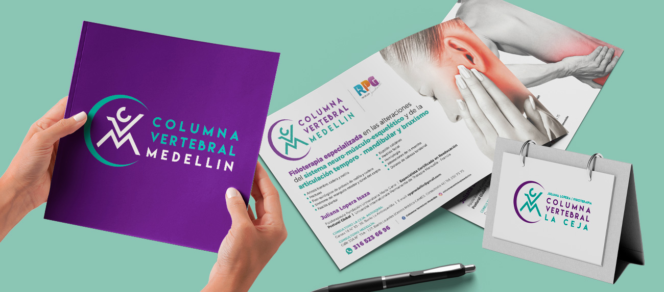
The challenge was to build a brand identity from the ground up for a new, cutting-edge physical therapy service. The specialist, Juliana Lopera, required a visual positioning that effectively communicated the promise of her revolutionary method: a faster, more effective recovery from pain compared to conventional treatments, aimed at an audience seeking premium health solutions.
Process and Solution:
My process focused on translating the clinical benefit of the RPG (Global Postural Re-education) method into a clear visual concept. The conceptual challenge was twofold: first, to subtly integrate the brand’s initials, and second, to evoke the core concepts of pain relief, movement, and dynamism. The solution was a fluid logomark that represents the spinal column regaining its natural alignment while abstractly forming the brand’s initials.
The Result:
The result was a clean, modern, and memorable visual identity that successfully positioned the practice as a specialized, high-end center. The new branding not only generated immediate recognition but also provided the brand with the credibility and professionalism required to attract its first patients and establish a solid foundation in the health and wellness market.
Date
octubre 17, 2025

